Allow a few seconds for animations to fully load...

Motion principles

Even subtle motion can create strong engagement. These guidelines define how animation should be used at IGA to guide attention, highlight what matters most, and support clear communication. Our motion design should be intentional, visually engaging without distraction, easy to understand, and enhanced with a touch of playful energy.

Welcome to our animation playbook. Follow these principles to guide motion design. Keep animations playful and engaging — never exaggerated or cartoonish.

Staging
Use motion to highlight what matters most. Every movement should guide the viewer’s attention.

Overshoot
Let animations slightly pass their final position, then settle back for more natural motion.

Anticipation
Add a brief wind-up before major movements to prepare the viewer for the action.

Easing
Use easing to control speed and smooth transitions. Apply it where needed for natural flow.

IGA logo

Always adhere to the brand guidelines around logo usage. Depending on the situation choose either stacked, landscape version in either white or charcoal text. There is also instances to use the logo or the ‘You can’t beat local’ tagline on its own.

IGA logo
Always use this version for all our owned channel assets.

IGA slanted logo
DO NOT use the tilted logo in any of our owned channel assets. This is just to be used with campaigns or paid media.Logo angle is always 21.9 degrees.

Primary YCBL stacked logo

Secondary YCBL stacked logo

YCBL Tagline

Typography

Text animation is used to improve emphasis and readability. Motion should support legibility, avoid competing on-screen movement, and allow enough time for content to be comfortably read before new text appears. Always use approved brand typefaces. Custom typography animations are permitted when needed, but must follow our core motion principles. Below are examples of how headlines and other text can be animated in.

Slide down from above

Slide up from below

Slide in from right

Slide in from left

Slide down from above with some playfulness

Slide up from below with some playfulness

Scale up from centre with a bounce
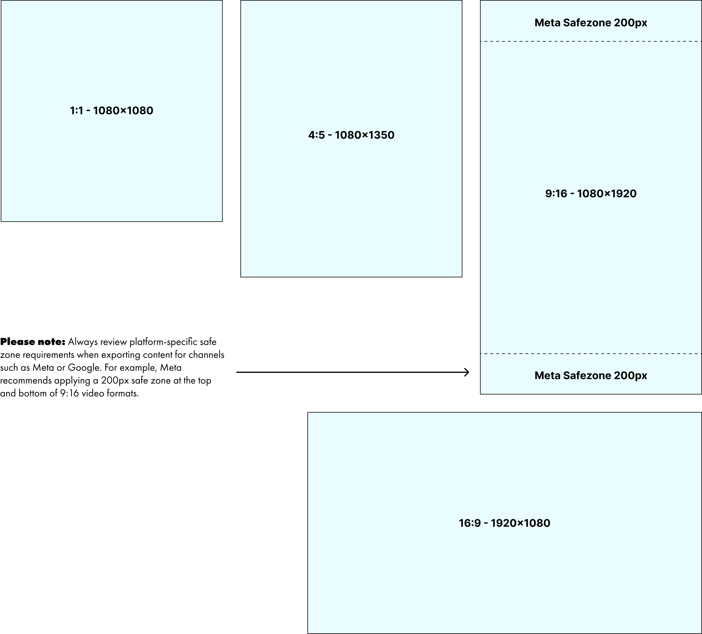
Oval motif

The oval motif is a core IGA brand shape used to draw attention to key elements such as products, add visual energy as a background feature, or create dynamic entry and exit motion for on-screen content. It may also be used as an image mask.

All applications should align with our established motion principles. Here are some examples of how it can be used.

Price bombs, callouts and CTA’s

Price bombs, callouts, and CTAs should animate with impact while remaining consistent and aligned with our motion principles.

Key value elements such as half-price bombs and primary CTAs may receive an additional emphasis animation once other on-screen elements have settled. Below are some examples of usage.

Modular layout combinations

By combining our core motion and design elements including typography, motifs, and other callouts, we can rapidly create flexible layouts that remain visually consistent. This modular approach enables a wide range of creative executions while preserving a cohesive brand look and feel. Here are some examples of using this approach to create different styles for digital screens.

Asset sizes & safezones

Animations should be produced in the following four standard aspect ratios to ensure coverage across all major platforms: 1:1 (1080×1080), 4:5 (1080×1350), 9:16 (1080×1920), and 16:9 (1920×1080). When exporting for platforms such as Meta or Google, ensure all content remains within required safe zones. Safe zones are areas of the frame that may be obscured by platform UI elements or cropped on different devices. Avoid placing key information such as logos, pricing, headlines, or CTAs within these regions. Always refer to each platform’s specifications for precise guidelines.
Guide Specs

P&P animations

Many animations require P&P content across multiple themes, formats, and channels, often with additional elements such as callouts, disclaimers, or secondary logos. Animating every element is rarely necessary or effective.

Tip 1: Prioritise up to two or three key elements — typically the featured product, the primary value message (such as a half-price offer), and an optional supporting callout (for example, seasonal or promotional). Supporting content such as descriptions, secondary logos, disclaimers, and headers should remain subtle, using simple transitions or static placement. This approach keeps attention focused on what matters most while streamlining production.

Tip 2: When adapting P&P assets across multiple formats, plan for scalability from the briefing stage. While 9:16 layouts allow more visual space, smaller formats may require selective content reduction. Designing with this in mind enables clearer messaging and stronger visual impact, rather than forcing all elements into limited space.

Animation templates

A set of existing animation templates is already in use across sale intros, digital screens, and select P&P applications. Some animations are evergreen and should be reused without modification, particularly awareness-based assets such as “Low Price Every Day” and “Price Match.”

As the brand and content needs expand, developing scalable and flexible templates will be essential to support multiple use cases while maintaining visual consistency. The examples below represent the current template range. As this library grows, a centralised resource documenting usage guidelines, file locations, and asset details will become critical for both designers and stakeholders during the briefing and production process.

Price Match

Low Prices Every Day

Weekly Sales

Shop Online

Great Weekly Specials Digital Screens

Easing

The Graph Editor in After Effects provides a powerful and intuitive way to control easing without relying on plugins. While it may feel unfamiliar at first, it enables fast, precise motion control and is central to achieving the animation styles demonstrated in this guide. The examples below illustrate common curve types and the motion characteristics they produce, particularly for managing anticipation and overshoot in line with our motion principles.

Numerous free tutorials are available to support learning this tool. Mastering the Graph Editor is strongly recommended, as it improves creative control, complements plugin-based workflows, and helps maintain consistent motion quality and brand tone across all animations.
Ease in

Standard
Typical ease in ease out curve

Accelerate

Accelerate
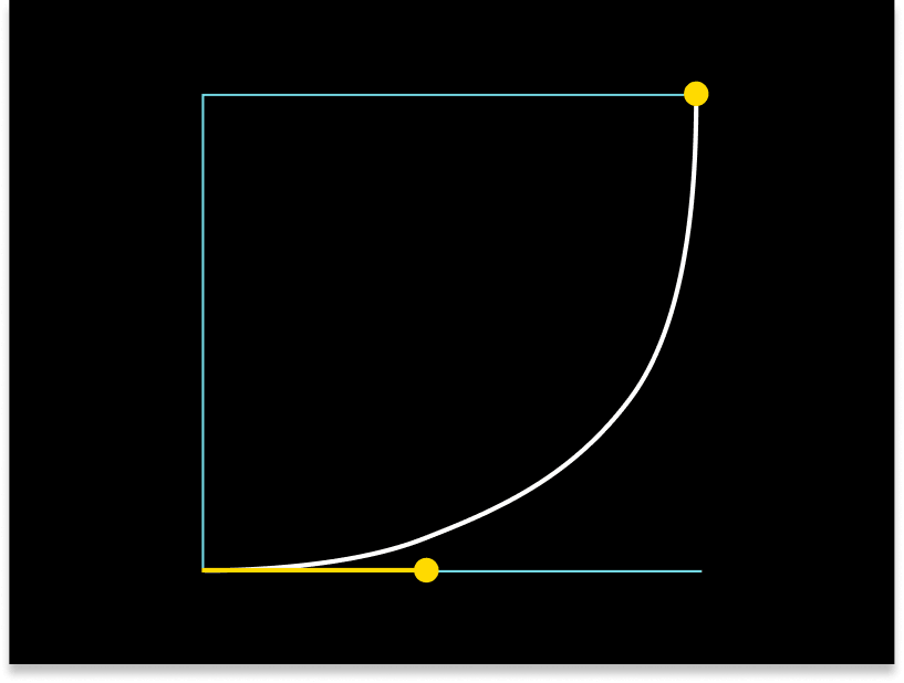
Typical ease in then accelerate curve
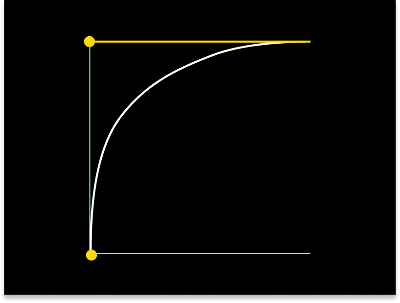
Decelerate

Decelerate
Typical accelerate at start, then quickly ease out curve

Tip! The flatter the curve the slower acceleration. The steeper the curve the faster acceleration.

Workflow & Production Standards

Designers may use animation plugins where appropriate, provided they are accessible to the wider team and produce results that align with the motion principles outlined in this guide. Templates should be built using a modular approach, leveraging existing approved elements to ensure consistency and efficiency. Custom animations are encouraged when required, as long as they maintain the same visual tone, motion quality, and brand feel defined by these guidelines.

Stakeholder Briefing Best Practices

High-quality animation outcomes begin with well-structured briefs. Considering key factors such as format sizes, duration, messaging hierarchy, animation priorities, and timing at the briefing stage significantly improves efficiency and creative results. When briefs are incomplete or underdeveloped, projects are more likely to require rushed production, multiple revisions, and compromises in quality. Clear, considered briefs enable designers to work faster, make better creative decisions, and deliver stronger, more consistent motion outcomes.